Color Accessibility is Key to Making Your Site More Inclusive
Are you scared of taking the first step toward website accessibility? You are not alone, but you needn’t be scared. Some aspects of accessibility conformance are more technical than others, but many of them are common sense, best practice, or just require a little bit of effort.
Start taking accessibility seriously in a simple but high impact way: test your site’s color scheme for those who experience color blindness or “low vision”—such as those with glaucoma, cataracts, diabetic retinopathy, or macular degeneration.
For more tips on starting with accessibility, read Pantheon's Website Accessibility Primer.
Why does color make such a big difference? Vision impairments are common, from the relatively minor, like those who need glasses, to the more severe. At some point in life, anywhere between 14-20% of the population is affected by a partial or full vision impairment.
We have all encountered text that is too light on a white background, or too dark on a dark background. Older eyes or those that are tired from staring at a screen all day have an even harder time than younger and “fresher” eyes. In some cases, the standards below help those of us with temporary vision deficiencies due to lack of sleep or too much time in front of a screen.
Unless you yourself have vision trouble, it is a silent, personal disability. Making sure your brand colors meet minimum guidelines for accessibility is an important step towards making a website more inclusive. Luckily, there are many tools and guidelines that can help.
This article explains color contrast ratios, provides an overview of accessibility standards, and talks through some tools and guidelines. At Oomph, we use a tool that we have created internally—more on this below.
What Is a Color Contrast Ratio?
A contrast ratio is a mathematical difference between a foreground color (text, typically) and a background color. If the contrast is not high enough, anyone will have a hard time reading the content. Low contrast is 0.0 and the highest contrast (black over white) is 21.0.
The math involved measures the luminosity of one color against another. The luminosity is the perceived energy that a color emits. Generally, colors with a high luminosity appear bright while those with low values are dark. Because colors are perceived differently by different people, the accepted guidelines set a minimum for how similar two colors can be. Too similar, and they are an inaccessible combination.
What Are the Standards?
The Web Content Accessibility Guidelines 2.1 (WCAG 2.1) have been created with color contrast ratio thresholds to use as a benchmark. They outline the following ratios that are required to conform to two different levels (AA or AAA — there is no recommended minimum for Level A):
Level AA recommended minimum contrast ratios:
For all text or images of text, a ratio of 4.5:1 is required, except for the following:
Large text: Text 24px and larger or 19px and bold or larger and bold, a ratio of 3.0:1 is required
Incidental: Text or images of text that are part of an inactive user interface component—that are pure decoration—have no contrast requirement
Logotypes: Text that is part of a logo or brand name have no contrast requirement
Level AAA (enhanced) recommended minimum contrast ratios:
For all text or images of text, a ratio of 7.0:1 is required, except for the following:
Large text: Text 24px and larger or 19px and bold or larger and bold, a ratio of 4.5:1 is required
Incidental: Text or images of text that are part of an inactive user interface component—that are pure decoration — have no contrast requirement
Logotypes: Text that is part of a logo or brand name have no contrast requirement
In plainer English, this means that all text over any other color should have a contrast ratio of 4.5. If the text is larger than 23px, or bold and larger than 18px, it can have a contrast ratio of 3.0 (these are Level AA targets, the level we generally recommend). For sites where accessibility is very important—think banking, healthcare, and government websites—the higher levels of 7.0 and 4.5 should be used, respectively. Notice that logotypes or illustrations do not need to meet these requirements.
Our color contrast tool’s feedback includes success or failure criteria for all three contrast levels—3.0, 4.5, and 7.0. No matter the target your project needs to hit, it will show how each color fares with each level of conformance.
What Does Color Blindness Look Like?
There are eight different variations of color blindness. The most common are green or red “weak” deficiencies. The person sees some red and some green, but not as strongly. Blue deficiencies are rarer. Rarer still are dichromatic views, which means the person is completely blind to one color. And the rarest are those that perceive no color at all.
These examples were taken from a great visualization tool at Color-Blindness.com:
Image
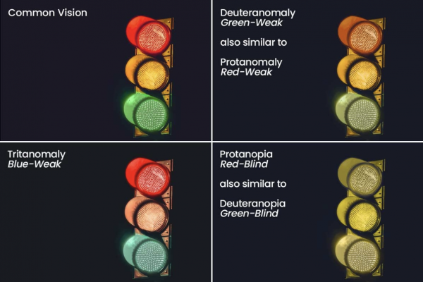
Some might notice the differences right away while others might think a few of these look the same. If your eyes are weak in the blue cones, yellows are hard to see and greens might look blue. If your eyes are weak or deficient in the red or green cones, the color depth is lost and the world looks monochromatic.
A traffic light is a great example of an accessible element from our everyday life. While most of us associate the traffic signal with colors, those that can not perceive color can still derive meaning from the signal by the position of the light in the top, center, or bottom. Color alone is not the only means of distinguishing information—that’s WCAG 1.4.1, but we’re getting ahead of ourselves.
Introducing the Color Cube Testing Tool
When we work to make a brand more accessible, we test a list of colors with a tool we developed that we call Color Cube. Unlike the other great tools available for color contrast testing, we developed this to review a brand’s entire color palette. The tool gives us as much information as possible. For each color in the list, the tool provides its hex and HSL (Hue, Saturation, Lightness) values, and how that color performs against white and black.
See a demo of Color Cube in action.
Because it's evaluating the entire color palette, Color Cube also shows the most successful color pair from the array provided. More than this, the tool was created so designers and developers do not have to use Photoshop to mix a variation of a color that passes the required criteria. Here’s how that works:
Adjusting an Example Brand Color to Pass Contrast Ratios
Say a company uses red as a brand color—as Oomph does. Our red passes Level AA when used over white but not when used with black. What should we do to make that color conform to Level AA criteria?
First, we load up the colors in ColorCube (the demonstration color palette already contains the red we are discussing). We can see that it does not pass over #101010. It fails by 0.72 with a color contrast of 3.78. We need it to pass at 4.5. The HSL values for this red are H11, S99, and L42.
We don’t want to change the kind of red this is, so we do not touch the hue controls. (Hue is like the soul of the color. Too much of a change here, and you get a different color entirely.) We are already at almost 100% saturation, so making the color more saturated will not help. Instead, we increase the lightness value from 42 to 50.
Press the small up arrow in the “L” field (or use the keyboard arrow “up” key once the cursor is inside the number field) to see the test results update in real-time. The results move from failing to “edge” to passing once we hit 50% lightness and a passing contrast ratio of 5.12. The new hex value has also been updated, and we can cut and paste that into our site’s CSS code.
Most people will not notice that the red color has changed slightly over a dark background. In the image below, we show the original color over white and the new color over black. Because the backgrounds are so different, it is hard to perceive a change in the base color.
This is why we prefer to use the HSL color space. Unlike RGB, it is more intuitive. It is easier to change only saturation or lightness to get a failing color to pass. And most people won’t even notice that there was a color change.
This is how we move a client’s brand color from failing to passing, and now you can do it too.
What Happens When a Passing Color Doesn't Work?
It sometimes happens that a color is very problematic to adjust. Yellows, oranges, and light, bright blues can present failing grades with white. Adjusting a light color to pass with white might result in a darker, browner color than intended. In these cases, a conversation with a designer or someone from the brand team might help. It could be that an orange button with white text is just not going to make the brand team happy or meet accessibility standards. Try a different color text, larger or bolder text, or scrap the orange for this purpose altogether.
Not all colors will be accessible and stay true to the brand’s intention. Those colors are the ones to use as decoration colors, not as colors that need to convey important information.
The First Step to Making Your Website More Accessible
Don’t be scared of starting to make your digital property more accessible. Get started by testing and adjusting your company’s brand colors and make significant progress towards your accessibility goals. These new colors can be used to make any digital property in your suite more inclusive.
Reach out to J. Hogue on Twitter or email or drop an issue into GitHub. Contributions are welcome! Improvements to the tool are on our roadmap and include responsive design enhancements, saving and sharing color palettes, and making it a progressive web app that can be used offline.